Visualization: Line Charts
Learn about INSIA's Line Chart Visualization feature.
Last updated July 22, 2024
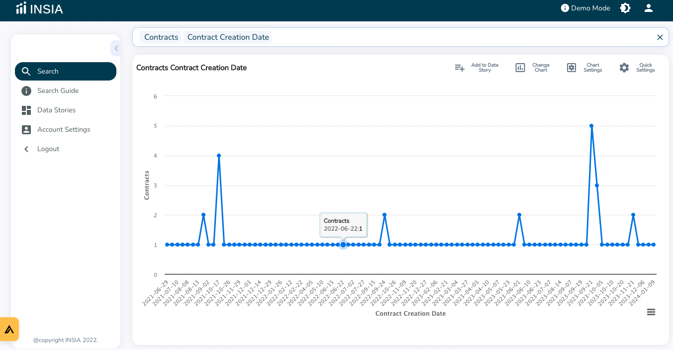
The Line Chart is one of the simplest forms of chart that connects all data points in the graph using a line. It represents a single dimension applied to a single metric. The line chart is the default chart when you slice metric data with a time dimension.
For Example, You want to see Contracts by Contracts Creation Date. The Y-axis of the line chart represents the Contracts Creation Date (Dimension) and the X-axis represents the Contracts (metric). The line will depict the creation date of the contracts.
On the Line chart, you can use all features:
Setting alerts
Performing drill-downs
Generating i360 reports
Read next: