A CFO’s ability to provide clarity, speed, and strategic direction has never been more critical, and financial data visualization is now the fastest path to delivering those outcomes.
Today 89% of finance leaders admit to making monthly decisions with incomplete or inaccurate data, the need for intuitive, real-time insights is urgent.
Modern CFO dashboards consolidate financial information from ERP, CRM, and other systems, creating a single source of truth accessible at a glance. Not only does this simplify complex data, but it enables immediate pattern recognition: trends, risks, and opportunities become visible within moments.
This is especially crucial considering that 65% of people are visual learners, making financial data visualization not just a reporting tool, but a strategic advantage for accelerating organizational understanding.
At a Glance
- Financial data visualization transforms complex financial data into visual formats, making it easier for decision-makers to identify trends, anomalies, and opportunities quickly.
- Key techniques include line charts for trend analysis, heat maps for spotting patterns, and candlestick charts for stock market insights.
- Popular tools like INSIA, Excel, Power BI, and Tableau help CFOs streamline decision-making with interactive, real-time dashboards.
- Advanced techniques, such as predictive analytics and AI-driven insights, improve forecasting and proactive financial management.
- Despite challenges like data complexity, effective visualization tools and practices can enhance clarity, reduce errors, and enable faster, more confident financial decisions.
Why Financial Data Often Fails to Communicate Clearly
Financial reports are dense. Spreadsheets stretch across screens, and critical insights hide behind layers of numbers. Whether you're managing investments, presenting to stakeholders, or just trying to make informed decisions, the challenge is the same: turning raw financial data into something people can understand—quickly, and with context.
What Is Financial Data Visualization?
Financial data visualization is the process of transforming complex financial data like income and expenses, profits, assets, liabilities, and equity into visual formats. The formats could range from charts, graphs, dashboards, to tables.
These graphical representations make the data easier to interpret and communicate, enabling stakeholders and finance professionals to identify key trends, correlations, and insights more efficiently than raw numbers alone.
What Is The Importance of Visualizing Financial Data?
The importance of visualizing financial data lies primarily in its ability to simplify and clarify intricate datasets that are often multi-dimensional and fragmented.
Visualization helps decision-makers by enabling a faster grasp of financial health and trends through visual insights:
- It reveals patterns such as revenue growth, cost fluctuations, profit margins, and cash flow variations, which might be obscured in tables or spreadsheets.
- Visual tools allow for instant spotting of anomalies, seasonal effects, or risk areas.
- Interactive dashboards offer drill-down capabilities and real-time updates, empowering finance leaders to monitor key performance indicators (KPIs) continuously and act swiftly.
Traditional financial reports often rely heavily on dense spreadsheets or textual summaries, which can be overwhelming, time-consuming to analyze, and prone to misinterpretation due to the reliance on numeric literacy alone.
They frequently fail to communicate the broader story or context behind the numbers. In contrast, visualizations bridge this gap by offering:
- Clear, concise communication of complex financial information,
- Enhanced engagement and accessibility for both finance and non-finance audiences,
- The ability to connect disparate data points into coherent narratives,
- Support for real-time monitoring and scenario analysis,
- Reduction in human error by highlighting outliers or inconsistencies visually.
To truly transform complex data into actionable insights, finance professionals need the right tools.
Why Finance Teams Struggle with Visualization
Even with access to powerful tools and abundant data, many finance teams still hit the same walls:
- Data fragmentation: Information lives in silos across ERP, CRM, and spreadsheets, making it hard to create a cohesive view.
- Manual workflows: Report generation often depends on time-consuming and error-prone spreadsheet work.
- Inconsistent metrics: Differing formats and definitions across departments complicate analysis and lead to mismatched insights.
- Tool sprawl: Too many platforms with overlapping features create confusion rather than clarity.
- Limited accessibility: Visuals are often designed for finance pros, leaving broader teams without context or clarity.
These friction points don’t just delay reporting, they limit strategic visibility. Patterns go unnoticed, risks get missed, and decisions are based on stale or partial information.
This is exactly where INSIA offers a different path. Instead of stitching together scattered reports or waiting on static dashboards, INSIA provides a unified, real-time view of financial and operational data, automatically cleaned, mapped, and visualized.
Its AI-driven platform not only connects to over 30 systems, but proactively surfaces insights through features like Push AI, so finance teams stay ahead of issues rather than reacting to them.
Top Financial Data Visualization Tools for CFOs and Finance Leaders
Financial data visualization tools are essential for CFOs and finance leaders to convert complex financial data into clear, actionable insights.
These platforms help streamline decision-making by consolidating data from multiple sources, enabling real-time monitoring, and providing interactive dashboards tailored to diverse stakeholder needs
| Tool | Best For | Used By |
|---|---|---|
| INSIA | Unified finance dashboarding with AI-powered insights | CFOs, Controllers |
| Excel | Quick charts, pivot-based dashboards | Analysts, FP&A teams |
| Power BI | Real-time dashboards & DAX formulas | Finance & IT teams |
| Tableau | Interactive visual storytelling | Strategy/BI teams |
| Google Data Studio | Simple cloud-based visuals | Small biz, marketing |
INSIA stands out by unifying complex financial data streams into intelligent dashboards enriched with predictive analytics and tailored alerts. Its finance-specific design empowers CFOs and controllers to cut through noise, ensure data integrity, and make faster, more confident decisions.
Understanding chart types and methods helps reveal key insights more effectively. Let's explore powerful financial data visualization examples and techniques to enhance your analysis and decision-making.
Also Read: Big Data Analytics in Financial Services Industry
Core Financial KPIs Ideal for Visualization
- Revenue (Monthly/YoY)
- Gross Profit Margin
- Operating Expenses
- EBITDA
- Net Income
- Cash Flow (Operating, Investing, Financing)
- Budget vs Actual Variance
- Working Capital Ratio
These KPIs offer clarity on profitability, efficiency, and financial health—making them ideal for dashboards and stakeholder updates.
How to Choose the Right Chart: A Quick Checklist
Use this mini-framework to match your data type to the best chart:
- Trends over time? → Line or Area Chart
- Part-to-whole comparison? → Pie or Stacked Bar Chart
- Category comparison? → Bar or Column Chart
- Distribution or spread? → Histogram or Box Plot
- Relationships or correlation? → Scatter Plot
- Volatility or high-frequency changes? → Candlestick or Sparkline
- Geographic data? → Heat Map or Geo Chart
When in doubt: prioritize readability, highlight what's actionable, and avoid clutter.
Financial Data Visualization Examples and Techniques
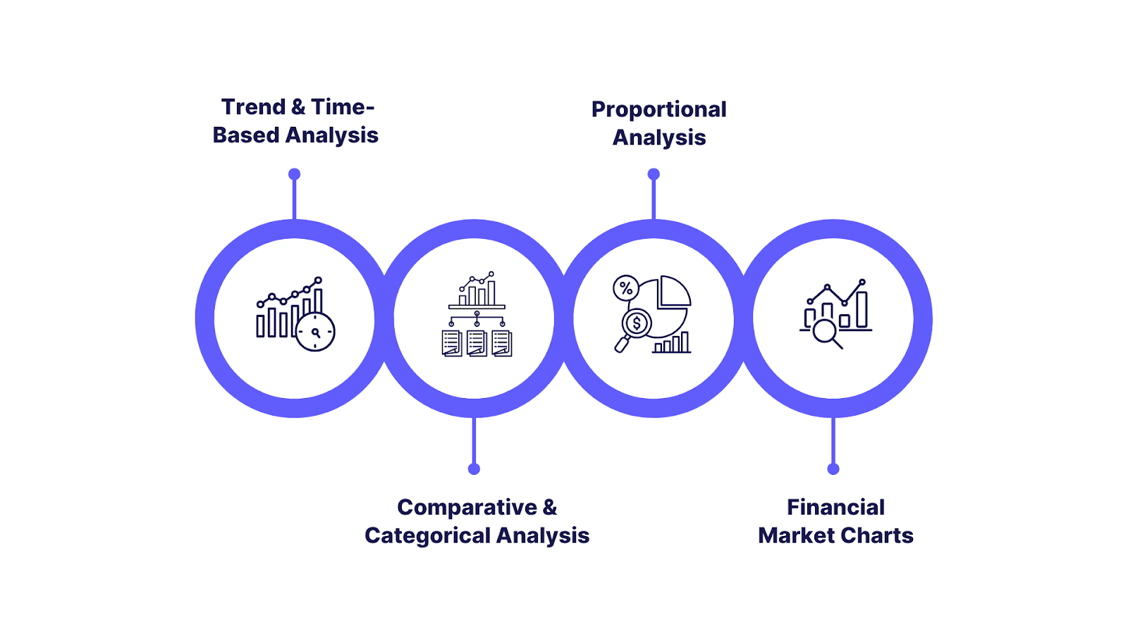
Effective financial data visualization transforms raw data into powerful visuals that reveal insights, simplify decision-making, and enhance communication.
Grouping chart types by usage and complexity offers a practical approach to selecting the right method depending on analytic goals and user expertise.
I. Trend & Time-Based Analysis
1. Line Charts
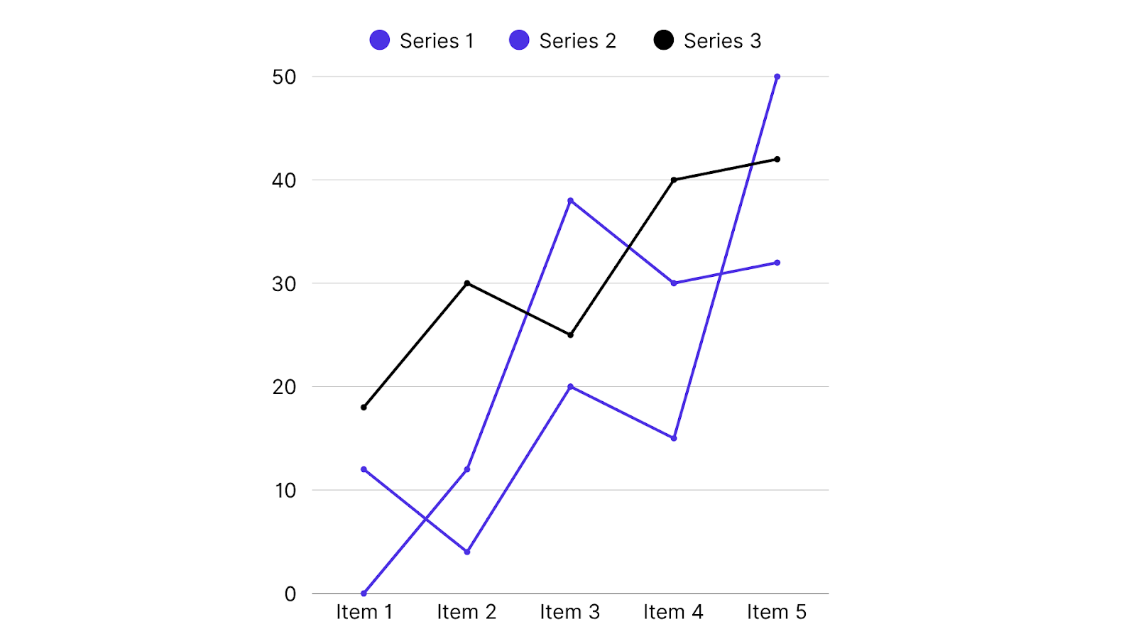
Line charts are foundational for tracking financial trends over continuous time intervals, whether days, months, quarters, or years.
By plotting data points connected with lines, these charts expose upward or downward trends, seasonal cycles, and inflection points. Common financial metrics visualized with line charts include revenue growth, stock price fluctuations, profit margins, and cash flow.
- Advantages: They enable easy detection of trends and facilitate forecasting by projecting historical data visually. Multiple series can be overlaid with distinct colors for comparative analysis (e.g., comparing revenues across regions).
- Design Tips: Ensure clear axis labels with units, apply consistent scaling, use contrasting colors to differentiate series, limit to 2-3 lines to avoid clutter, and use selective smoothing (like moving averages) cautiously to highlight trends without obscuring data variability.
â€
2. Area Charts
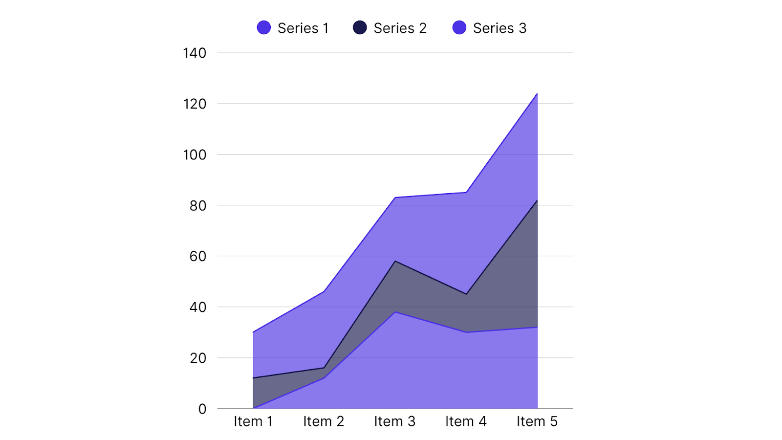
Area charts extend line charts by shading the area beneath the line, emphasizing volume or cumulative totals over time.
These are particularly useful for showing aggregated metrics, such as cumulative revenue growth, investment portfolio values, or debt versus equity composition.
- Use Cases: Illustrating how different components stack up to a total, for example, revenue by product line accumulating to total sales.
- Design Tips: Use stacked area charts with harmonious but distinct colors, thoughtfully order layers for clarity, limit the number of layers to prevent complexity, and provide clear legends to guide interpretation.
II. Comparative & Categorical Analysis
1. Bar & Column Charts
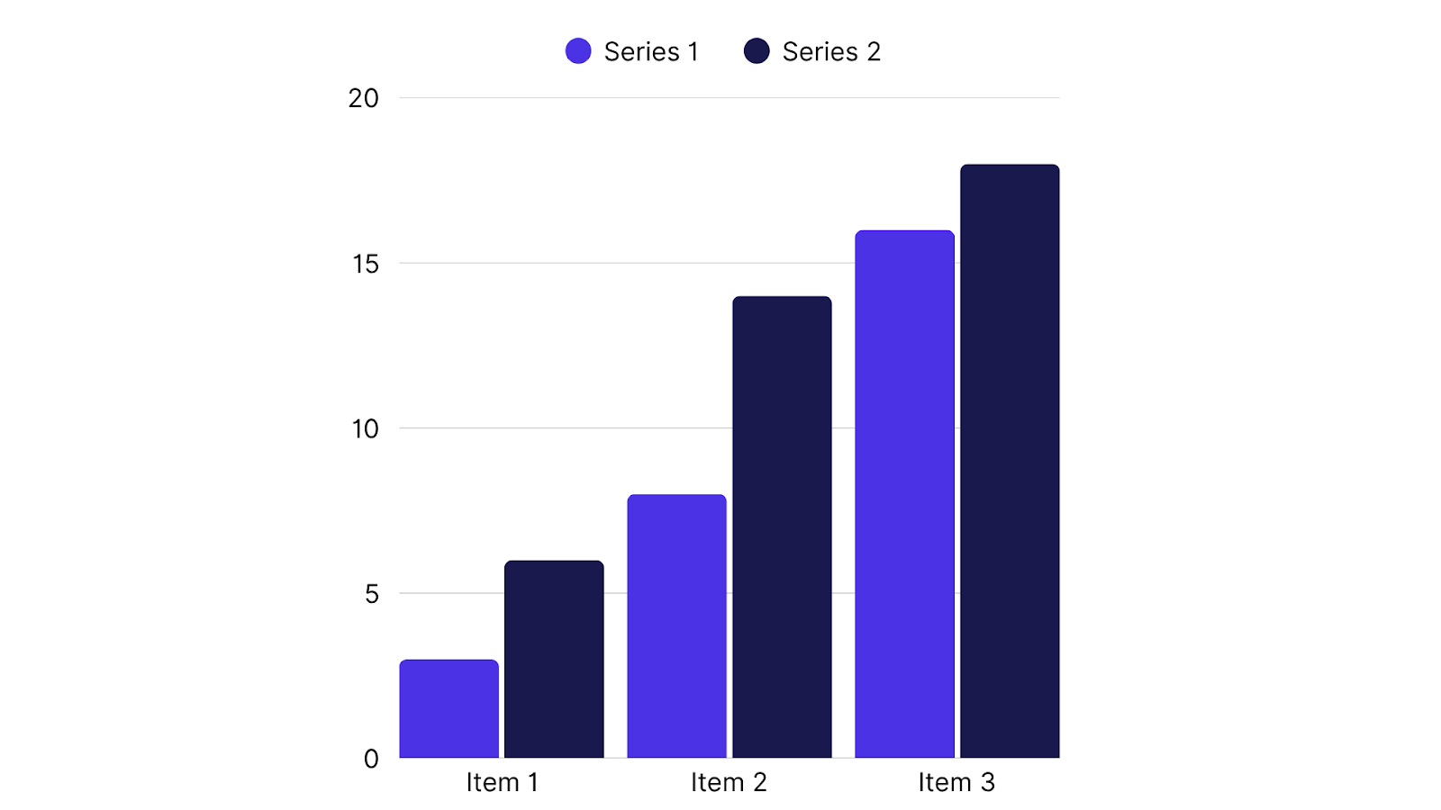
These charts offer straightforward comparative views across categories or time periods. While both display values as rectangular bars, their orientation differs and suits different scenarios:
| Aspect | Bar Chart | Column Chart |
|---|---|---|
| Orientation | Horizontal bars | Vertical bars |
| Category Axis | Vertical (Y-axis) | Horizontal (X-axis) |
| Value Axis | Horizontal (X-axis) | Vertical (Y-axis) |
| Best For | Many or long category names, side-by-side comparison | Time-based comparisons and trend visualization |
| Label Readability | Easier for long labels | Better for short/time-oriented categories |
- Use Cases: Comparing departmental revenues, budget versus actual expenditure, or ranking products by sales.
- Design Tips: Maintain clear, descriptive axis labels, uniform bar widths and spacing, avoid unnecessary 3D or decorative effects, use contrasting colors to emphasize key comparisons, and limit the number of bars (ideally under 15) to reduce clutter.
2. Heat Maps

Heat maps visualize large datasets by mapping data values to color intensities in a matrix format, revealing patterns, concentrations, or anomalies at a glance.
- Use Cases: Market or asset value fluctuations by region and time, risk exposure analysis, portfolio diversification insights.
- Benefits: Quickly highlight hotspots and correlations across variables.
- Limitations: Overusing colors can confuse; precise numerical comparisons are harder; crowded maps may obscure details.
III. Proportional Analysis
1. Pie & Donut Charts
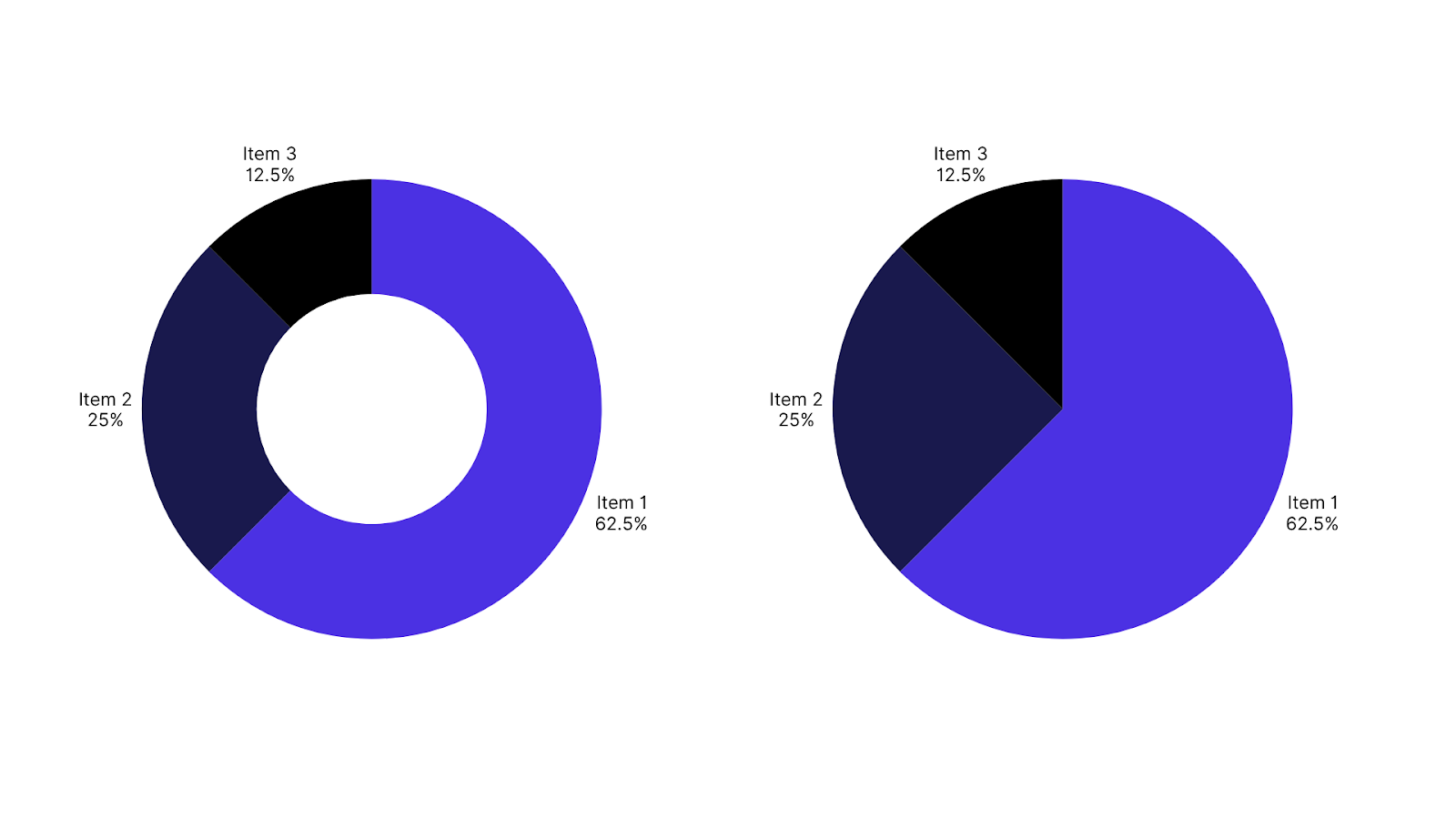
These charts visualize parts of a whole, dividing a circle into slices proportional to category sizes. While intuitive for small category counts, they have limitations.
- Criticisms: Difficulty interpreting multiple small slices, less accuracy in comparing angles or areas versus length-based charts.
- Use Cases: Market share, expense distribution by category when the number of segments is limited.
- Alternatives: Stacked bar charts or column charts often provide clearer proportional comparisons. Platforms like INSIA enhance visualization flexibility by enabling dynamic switching between pie charts and alternative views within customizable reports.
IV. Advanced Financial Market Charts
1. Candlestick Charts
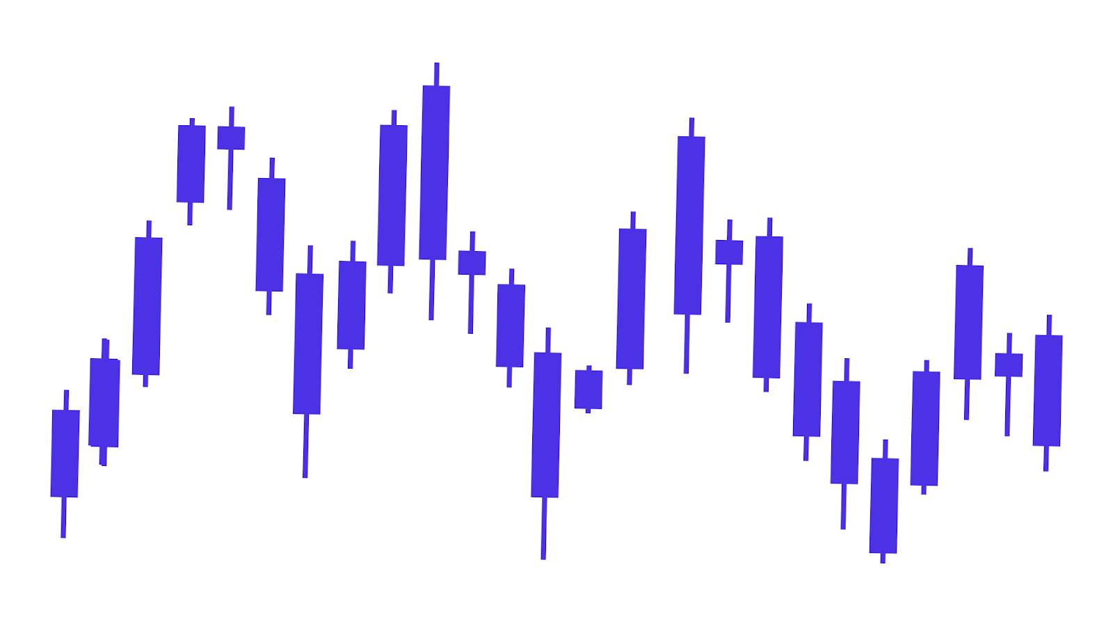
Candlestick charts are specialized visualizations used primarily in stock market analysis. Each “candlestick†represents four price points during a specific period: open, high, low, and close. The body’s color and shape indicate market direction and sentiment.
- Insights: Traders identify patterns such as bullish/bearish engulfing, doji, and morning star formations to predict price trends and make informed trading decisions.
2. OHLC (Open-High-Low-Close) Charts
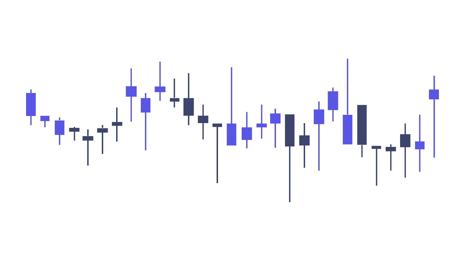
OHLC charts show the same price data as candlesticks but rely on vertical lines and ticks instead of filled bodies, providing a cleaner, less visually dense representation preferred by some professionals.
INSIA integrates advanced AI-driven insights atop these charts, enabling predictive analytics, anomaly detection, and real-time market trend forecasting for deeper strategic financial decision support.
V. Relationship Analysis
1. Scatter Plots
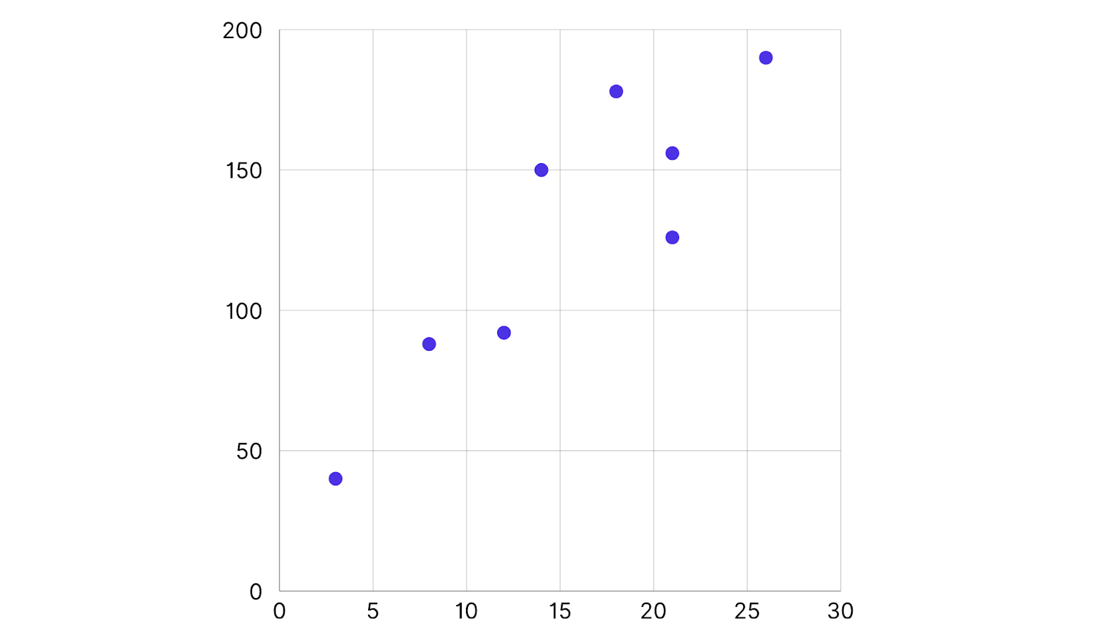
Scatter plots graphically display the relationship between two quantitative variables, such as sales versus profit margin, by plotting individual data points on X and Y axes.
- Purpose: Detect correlations, clusters, outliers, and regression patterns that inform risk or opportunity identification.
- Enhancements: Incorporating a third variable via color, size, or shape enriches analysis by adding dimensions like geographical region or time period.
Using Dashboards for Financial Data Visualization
Dashboards consolidate diverse financial data into single, dynamic interfaces accessible in real time, facilitating rapid, informed business decisions.
- Benefits: Real-time visibility, improved efficiency, enhanced collaboration, goal tracking, and early risk identification.
- Essential Components: Relevant KPIs, interactive filters, diverse chart types, customization for user roles.
INSIA automatically connects with ERP systems and other data sources to bring all financial information together seamlessly. It enriches this data with AI-driven insights directly on customizable visual dashboards. Users get secure, role-based access to only the relevant data, with powerful drill-down and filtering options that make exploring complex financial details easy and intuitive.
Advanced Techniques for Enhanced Insights
Advanced visualization techniques improve interpretation and forecasting:
- Moving Averages & Trend Lines: Smooth volatile data to clarify underlying trends, aiding forecasting and scenario analysis.
- Color Coding & Thematic Maps: Dynamically highlight key metrics, risks, or regional performance using intuitive color schemes.
- Machine Learning & Predictive Analytics: AI models embedded within dashboards forecast trends, simulate scenarios, and identify anomalies, enabling proactive financial management. INSIA exemplifies this integration, transforming raw data into forward-looking, actionable intelligence.
While powerful techniques can enhance decision-making, financial data visualization also comes with its own set of challenges. Let’s examine some common obstacles in visualizing financial data and how to overcome them for more accurate, actionable insights.
Also Read: How to Perform Basic Cash Flow Analysis
Common Challenges in Financial Data Visualization
Financial data visualization faces several unique challenges that must be addressed to ensure accurate analysis, actionable insights, and effective communication.
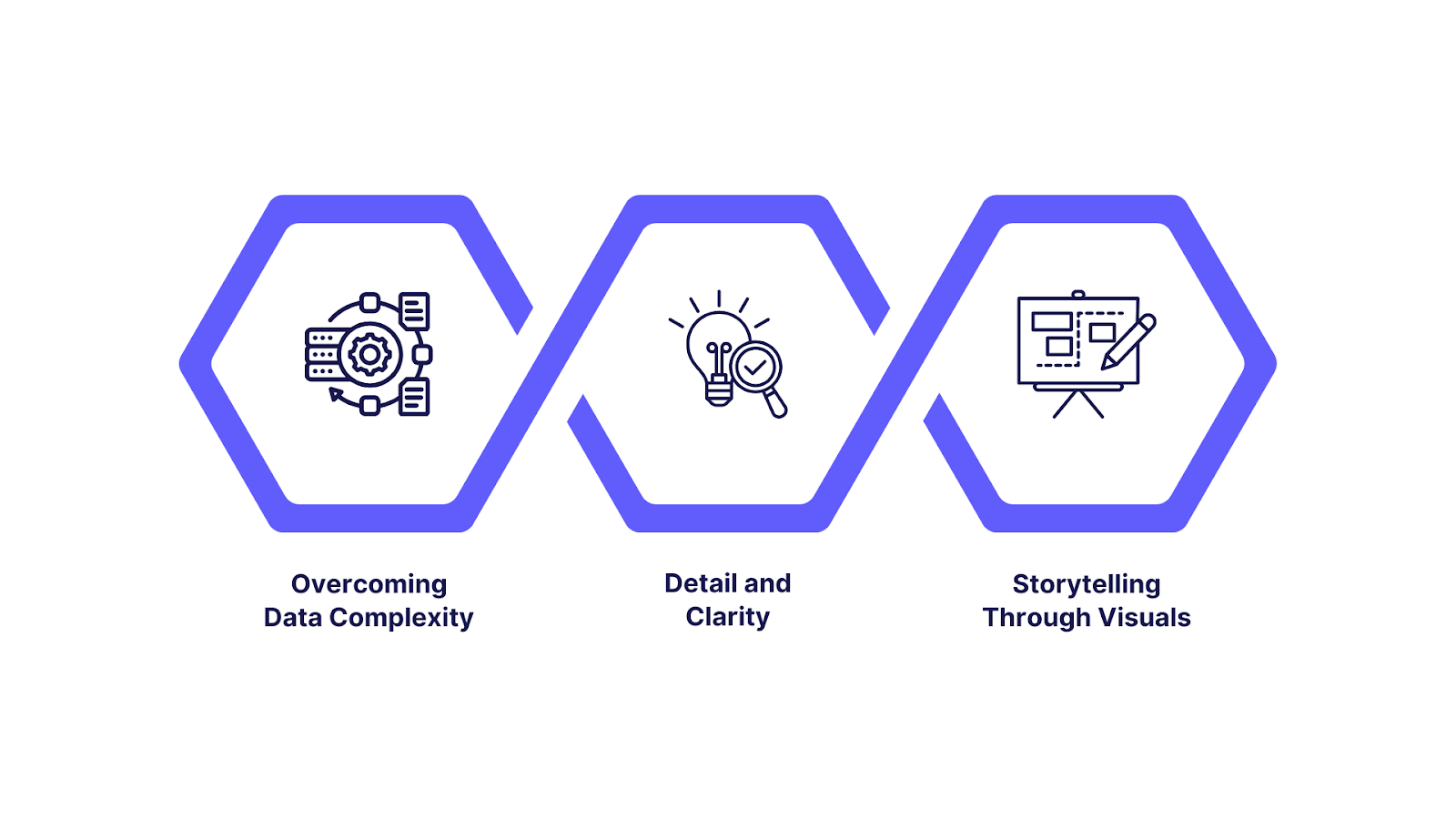
Below is an in-depth overview of the most critical issues, along with best practices for overcoming them, particularly in three key areas: data complexity and integrity, balancing detail and clarity, and ensuring accurate storytelling through design.
A. Overcoming Data Complexity and Ensuring Data Integrity
1. Challenges of Fragmented and Complex Financial Data
- Siloed and Disparate Data Sources: Financial information is often scattered across ERPs, CRMs, spreadsheets, and external feeds. Inconsistent data formats, granularity, or update cycles complicate aggregation and analysis, increasing the risk of discrepancies or omissions.
- Multidimensionality: Financial datasets involve multiple dimensions (time, departments, products, currencies), introducing layers of complexity when visualizing trends or relationships.
- Manual Data Handling: Relying on manual data extraction, transformation, or consolidation amplifies opportunities for human error, leading to incorrect or outdated visualizations.
2. Ensuring Data Quality in Visualizations
- Data Validation: Rigorous validation procedures—such as cross-system reconciliations, outlier detection, and duplication checks—are essential to prevent visualizing inaccurate data.
- Automated Data Cleaning: Employ automated tools for addressing missing values, standardizing formats, and dealing with anomalies to elevate baseline data integrity before visualization.
- Real-Time or Regular Updates: Keeping data visualizations refreshed ensures timely decision-making and reduces error propagation, especially in volatile markets.
Best Practice: Invest in robust data integration and governance platforms, automate cleaning, and audit regularly for compliance and traceability. Empower users with interactivity (filters, drilldowns) to verify underlying details where needed.
B. Striking the Balance Between Detail and Clarity
1. The Detail–Clarity Tradeoff
- Risk of Overload: Financial dashboards can easily become overloaded with KPIs, granular metrics, and multiple charts, hindering quick comprehension and diverting attention from core insights.
- Too Little Detail: Excessive simplification risks concealing essential trends or outliers, making visuals less actionable (e.g., showing only total revenue without breakdowns).
2. Best Practices for Managing Detail
- Limit Visual Elements: Present fewer than seven data points per chart to align with working memory limitations and promote effective pattern recognition.
- Contextual Layering: Use interactive elements—such as tooltips, drilldowns, or filters—to provide supplemental detail on demand, keeping primary visuals uncluttered.
- Hierarchical Design: Start with high-level summaries, then offer paths for users to explore details only as needed.
Best Practice: Use summary visuals or dashboards for executive overviews, and enable detailed, customizable exploration for analysts. Context (benchmarks, period comparisons, annotations) greatly enhances interpretability.
C. Ensuring Accurate Storytelling Through Visuals
1. Pitfalls of Poor Visualization Design
- Misleading Chart Types: Selecting inappropriate visuals (e.g., pie charts for time series, distorted axes) distorts relationships, exaggerates trends, or hides volatility.
- Color Misuse: Poor color contrasts or excessive color usage cause confusion or diminish accessibility for colorblind users.
- Missing Context: Absence of labels, scales, or explanatory commentary allows for misinterpretation and erodes trust.
Practices for Effective and Trustworthy Storytelling
- Select the Right Visuals: Match chart types to data (e.g., line charts for trends, bar charts for comparisons, waterfall charts for reconciliations). Avoid unnecessary 3D effects or decorations.
- Consistent Formatting: Apply uniform colors, fonts, and labelling conventions to aid readability and facilitate focus on the narrative.
- Clear Annotations and Context: Add explanatory callouts, legends, and historical baselines to guide user interpretation and underscore key findings.
- Regulatory Compliance: Ensure charts used for external reporting meet industry standards and preserve transparency for audit or regulatory review.
Best Practice: Treat financial visuals as a narrative. Frame each dashboard or report as a “data story,†supporting claims with clear visuals, contextual comparisons, and actionable conclusions tailored to the intended audience.
Also Read: Comprehensive Guide to Business Intelligence Dashboards
How INSIA Elevates Financial Data Visualization
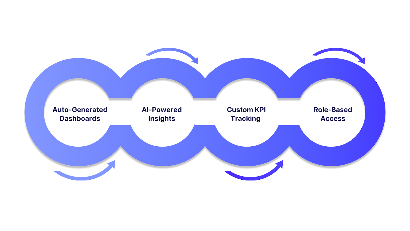
INSIA offers a specific, modern solution for overcoming the most persistent challenges in financial data visualization by using strong automation, AI-driven analytics, and secure, real-time interactivity.
1. Auto-Generated Dashboards from ERP Data
- INSIA automates the extraction, cleaning, and structuring of financial data from ERPs and other business systems, generating dashboards in minutes with no coding required.
- Users can customize dashboards to highlight critical financial KPIs like liquidity, profitability, or cash flow in real time, empowering leadership with an always up-to-date financial overview.
2. AI-Powered Insights Layered Over Visuals
- The platform’s AI surfaces key trends, anomalies, and risks directly atop charts and dashboards, moving beyond static reporting to provide pro-active, contextual insights.
- With features like predictive analytics and AI-driven ratio or trend analysis, INSIA enables faster, higher-quality financial decisions before issues are visible in traditional reports.
3. Custom KPI Tracking with Real-Time Alerts
- INSIA lets you define custom financial metrics and instantly set up intelligent alerts based on thresholds or expected conditions. Notifications trigger the moment your metrics deviate or cross targets, so emerging risks or opportunities are visible immediately.
- This instant feedback loop reduces error propagation and supports timely corrective action,even as markets shift.
4. Role-Based Access to Visual Reports
- Built-in security and governance ensure that dashboards and sensitive financial visualizations are only accessible to appropriate users based on finely grained, role-based access control .
- Stakeholders from executives to analysts see only what’s relevant to their responsibilities, supporting compliance and data privacy by design.
INSIA Addressing the “Common Challenges†in Financial Data Visualization
| Challenge | INSIA Solution |
|---|---|
| Data Overload | Automated KPI selection, summary dashboards, and AI-prioritized visuals reduce noise and elevate what matters most. |
| Visual Clutter | Best-fit chart recommendations and personalized dashboards prevent overloading, while interactive drilldowns keep visuals clean until more detail is needed. |
| Disconnected Sources | Unified integration, 30+ business systems and databases, ensures all financial data is centralized, standardized, and current in one platform. |
| Lack of Interactivity | One-click drilldowns, hierarchy-based navigation, and dynamic filters empower users to explore high-level summaries down to granular line items—without ever leaving the dashboard. |
| Delayed/Manual Reporting | Auto-generated dashboards and real-time refreshes automate workflows, vastly reducing reporting lag. |
| Security & Compliance Risks | Role-based access, audit trails, and compliance frameworks (GDPR, HIPAA, SOX) integrated into all visual and reporting workflows. |
Also Read: Advanced Financial Analytics Strategies for Optimizing Business Impact in 2025
Conclusion
Financial data visualization is at the forefront of a new era in finance, where clarity, agility, and strategic insight are essential for every decision-maker.
As technology pushes the boundaries of what’s possible, finance professionals are increasingly able to move beyond static reporting toward interactive, predictive, and truly actionable dashboards.
Platforms using AI and machine learning deliver intelligent, tailored insights and automate complex analysis.
INSIA exemplifies this next generation by integrating real-time automation, custom visual analytics, and role-based insights.